
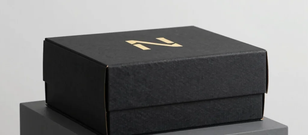
Packaging design acts as the primary physical bridge between a brand and its customer. In today's digital landscape, however, that box must perform twice: first under studio strobes for digital storefronts, and later in the customer's hands during unboxing. Crafting tactile packaging demands careful attention to substrate textures, foils, and typography scale.
Material Choice Meets Sensor Resolution
Matte soft-touch laminates paired with metallic foil stamping create visual contrast that captures camera sensors beautifully. Under directional studio lamps, debossed elements cast micro-shadows that emphasize premium craft. Choosing materials with distinct physical depth elevates digital imagery effortlessly.
Avoid ultra-reflective glossy coatings across large surface areas, as they create harsh glare that obscures brand typography. Instead, use localized spot UV varnish on key logos or geometric accents over dark charcoal or obsidian backdrops.
Foil Stamping and Debossing Under Studio Lamps
Gold and copper foil accents add instant prestige, but catching their metallic sheen in a camera lens requires intentional angle alignment. Position typography and structural creases so light hits key focal points without creating blown-out white patches.
The interaction between metallic foil and deep obsidian cardstock gives packaging a sculpted, physical weight. This aesthetic translates into higher perceived value across mobile banners and print collateral alike.
Creating a Seamless Physical and Digital Narrative
Great packaging design harmonizes with your web interface and social presence. When the tactile box arriving on the doorstep mirrors the dark aesthetic seen online, brand authority is fully realized. Design with unified color systems and bold typography to build an unforgettable visual presence.